
Introduction
Many people have been asking me to say more about “Desirability Studies,” which I described in my Nielsen Norman Group article on user research methods as a way “to measure aesthetic appeal.” Desirability studies actually do more than just measure, as they can also be used to inform and even inspire different visual design directions you may be considering. In the landscape of user research methods I described in this article, it is classified as an attitudinal study that can be qualitative or quantitative (shown below as a “hybrid” method in the middle bottom area):

The problem of subjectivity
Desirability studies are far less well known, despite how important visual design is to user interfaces. Paul Howe wrote in and said, “I’ve done a lot of testing for aesthetic preferences but it usually feels like the least scientific part of all my user research.” This “less scientific” feeling to studying visual design is due to several causes. It is partly due to the way visual design itself is approached, often coming from the designer’s beliefs about what would best evoke the desired response. However, I would suggest that the approach in creating the design direction is not the only or even biggest issue – it’s the presentation of the design direction, which is often done in a largely subjective manner. For example, when presenting different design directions to a decision-maker, a visual designer might say something like:
“I recommend design C over A and B, because I feel it evokes the right kind of emotional response in our audience that is closer to our most important brand attributes, trust and fun.”
The problem with this type of presentation is that it frames the decision as a subjective interpretation of the design by internal constituents, and a decision-maker might feel his or her interpretation or gut feeling for the design is just as valid as the designer’s. And it is, at least in the sense that they are both just single individuals. Even though the designer ostensibly has years of experience knowing what types of designs evoke which types of responses, the authority of the decision-maker equals things out and, if there isn’t agreement, you often end up in a kind-of stalemate that doesn’t move things forward in a positive direction.
Two problems that Desirability studies could help solve here would be:
- To inform the design team as to why different design directions evoke certain responses in the target audience (in order to refine the direction); and
- To precisely measure visual design directions against specific adjectives (such as brand attributes) to help make a final decision.
Doing this puts the subjectivity where it belongs: as the voice of how the target audience feels about the design, not the designer or decision-maker. This empowers the designer and decision-maker to make an informed choice.
Another question is, “How can we predict real world behavior?” The answer is that we can’t do this with Desirability studies, since they are a measure of attitude rather than behavior (and we all know that what people say and what they do are often two very different things). You’re never going to get a good read on predicting real-world behavior from an inherently attitudinal study, but then Desirability is more concerned with the initial stages of the interaction with the product, rather than ongoing ones. The latter are more influenced by solid interaction design and ultimately, meeting an underlying user need. Positive (and subjective) aesthetic responses help get your target audience started using your site, but assuming you haven’t made egregiously bad choices (e.g., poor contrast or small targets), it probably won’t affect overall usability that much.
Types of Desirability Studies
There are two general classes of desirability studies: Qualitative and Quantitative. In the qualitative version, participants are brought into a lab or conference room individually and shown different visual design directions (e.g., mood boards or high-level designs) or visually designed interfaces (e.g., high-fidelity mockups of home pages). Below is an example of 3 different design directions from a Yahoo! Personals desirability study conducted by Jeralyn Reese and Michelle Reamy several years ago:

Participants are then given a set of index cards that have a description written on each card (usually adjectives), and participants are then asked to indicate which card goes best with each design direction. Below is an example of some of the descriptions on these cards:
Accessible Desirable Gets in the way Patronizing Stressful
Appealing Easy to use Hard to use Personal Time-consuming
Attractive Efficient High quality Predictable Time-saving
Busy Empowering Inconsistent Relevant Too technical
Collaborative Exciting Intimidating Reliable Trustworthy
Complex Familiar Inviting Rigid Uncontrollable
Comprehensive Fast Motivating Simplistic Unconventional
Confusing Flexible Not valuable Slow Unpredictable
Connected Fresh Organized Sophisticated Usable
Consistent Frustrating Overbearing Stimulating Useful
Customizable Fun Overwhelming Straight Forward Valuable
After the participant has selected cards that go with each design, the researcher asks them why they made the selection the way they did. This is the main benefit of this approach: finding out why certain designs cause certain reactions. This provides the design team with what they need to make an improved next version.
Because the sample sizes are small and recruitment into the study likely introduced additional biases, this is not an appropriate quantitative method. A quantitative version of desirability studies was developed a few years after the qualitative version came out. The idea is to represent the design directions in some kind of image that is embedded into a survey. This allows the researcher to gather larger, more representative samples of the target audience, often with results that are more generalizable.
The Yahoo! Personals desirability study mentioned earlier used a quantitative approach discussed here. This was important, because changing the visual design was a big decision: It was the first time the company was willing to change the design of a Yahoo! “property” (Mail, Personals, Finance) to more closely match the visual design style of its competitors, rather than continue to use the general Yahoo! design style found across the network. (The last of the 3 designs shown above won out).
Presenting Desirability Results
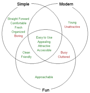
Just doing the study isn’t enough, especially when there is contention. One simple way to show the results is with a Venn diagram. Assume we have three design directions called “Simple,” “Modern,” and “Fun.” A summary of the results might look like this:
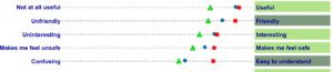
However, it may be important to show more methodological detail around the results, such as significance testing on the survey results. Mike Katz, Rian Van der Merwe and Christina Hildebrand pushed the desirability study methodology further at eBay. They used paired opposites in the survey, which allowed them to show the results like this:
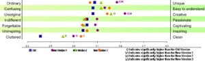
In another study, they were able to show the results of significance testing in the presentation of the results:
Published Papers on Desirability Studies
Desirability studies were first discussed in a UPA 2002 paper by Joey Benedek and Trish Miner of Microsoft, entitled “Measuring Desirability: New methods for evaluating desirability in a usability lab setting.” Later, Microsoft returned with a case study presented at CHI 2004 of how they modified this method to include a modified focus group discussion to the qualitative method. As far as I know, the quantitative version of desirability studies has yet to be published.
Conclusion
In summary, Desirability Studies are a great way of understanding the aesthetic and visual design directions you may be considering and ultimately measuring how much certain designs evoke certain responses relative to each other. This is most useful when you are trying to make a good first impression with your target audience and invite them to interact more deeply with your site or product so they can discover whether it will meet an underlying need. If all goes well with other aspects of the user experience, they will become a loyal user.